Monday, 11 April 2011

Final Project: Typeface Representing Ourselves


Rationale:
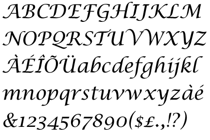
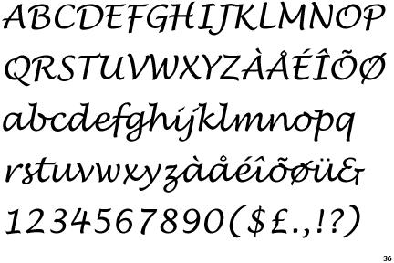
The typeface that I designed is named Cee. At the start of this project I had already decided to do a serif typeface. When looking at typefaces, I have always had a preference for those that are similar to actual handwriting, especially cursive. These are types such as Lucida Calligraphy, French Script and others. After researching different type designers and different typefaces, I decided to go with a typeface that resembled handwriting. Not wanting this typeface to be like other typefaces resembling handwriting I decided to add something that would help distinguish it. This was the extra thickness of the serifs and for the characters that seemed appropriate to have them as well as other sections of different characters. The typeface was also partly inspired by a design style art nouveau. The design style influenced and inspired some of the curves within the font. Although not all characters within the typeface had curves, they were in some aspects of their design still tied in with the other fonts.
The overall task of creating a font or typeface itself sounded at first harder than it actually was. Once creating basic shapes and characters it was easy to duplicate certain features of those characters to help create the rest of the typeface. The skill or ability to create a typeface was something that was fun to learn as well as practical. This is something that would be able to help in the future with other projects as well as something enjoyable to do. The final finished typeface was something that I was quite proud of in the time that I had to complete it. Although there are some aspects of certain characters that seem off to me for some odd reason I was happy with what was achieved. This font is something that represents the design side of me, the side that is inspired by art nouveau and is has more of a soft, flowing and natural style rather than a hard and intense style.

Research For Final Project: Typographer 3: Kris Holmes:

Bigelow and Holmes

Kris Holmes is an American typographer/type designer born in 1950. She studied calligraphy under Lloyd Reynolds, as well as taking a lettering class with Ed Benguiat. She eventually received her B.A. from Harvard University and in 1978 she began working with Charles Bigelow. The only formal training in type design that she has was a two week course with Hermann Zapf in 1979, shortly after this she went to work for HeilCo. in Germany as a type designer. Together with Bigelow, she designed or created typeface family Lucida. They also design the face Apple Chancery. Several of the fonts designed by Bigelow and Holmes are issued with several operating systems including Macintosh and Windows. Holmes is also the President of Bigelow & Holmes Inc., a typeface design studio. Lucida Calligraphy and Lucida Handwriting are two fonts that I am fond of when thinking of inspiration for my typeface.

Designed fonts
  • Lucida Grande
  • Lucida Sans
  • Lucida Console
  • Lucida Bright
  • Lucida Handwriting
  • Lucida Calligraphy
  • Lucida Casual
  • Apple New York
  • Apple Monaco
  • Apple Geneva
  • Apple Chancery
  • Apple Textile
  • Kolibri
  • Leviathan
  • Isadora

Lucida Calligraphy


Lucida Handwriting
 

Research For Final Project: Typographer 2: Paul Barnes:


Paul Barnes is a graphic designer who specializes in lettering, typography, type design and publication design. He was born in 1970 and in the early 90’s he worked for Roger Black in New York where he was involved in the redesigns of ‘Newsweek’ in the US and the British ‘Esquire’ and ‘Foreign Affairs’. He later returned to America and became the art director of the music magazine ‘Spin’. Since 1995 he has lived and worked in London. He has designed lots of books for publishers all over Europe. His interest in the modern and vernacular is shown through his type designs. They range from contemporary such as the design for Björk and to the extensive traditional British modern such as Brunel. In 2006 he was named one of the 40 most influential designers under 40 (in ‘Wallpaper) and a year later he was named one of the 50 best designers in Britain by ‘The Guardian’.

Typefaces designed by Paul Barnes
  • Brunel - 1996
  • Stephenson Sans - 2001
  • Ironbridge - 2002
  • Pagan Poetry - 2002
  • Austin - 2003
  • Stockholm - 2004
  • Dala Floda - 2005
  • Guardian Egyptian - 2005, with Christian Schwartz
  • Marian - 2005
Link to a site where you can view his works: http://moderntypography.com/Typedesign/index.html
 

Research For Final Project: Typographer 1: Max Miedinger:


Max Miedinger is a typographer most famous for being known as the type designer who created or designed the famous typeface ‘Helvetica’. He was a Swiss Designer, born in Zurich in 1910 and died in 1980. In the late 20’s Miedinger trained as a typesetter and he eventually went to work for Edouard Hoffman. Hoffman was the director of the Haas Typefoundry. Here, he worked mainly as a salesman but in his spare time he designed the sans serif face ‘Haas Grotesk’ which also came to be known as ‘Helvetica’. This was in the mid 50’s. The typeface was hugely successful and made him famous. Other faces he designed were, the whole ‘Helvetica’ family was well as fonts like ‘Miedinger’, ‘Monospace 821’ and ‘Swiss721’ and ‘Swiss 921’. 'Helvetica' is a font or typeface that is found on the logo and designs for many companies in today's society.


Type anatomy Exercise: Initials logo:


This type anatomy exercise was fun but slightly challenging. Finding the correct arrangement for the letters of my name was more challenging then I first assumed. I wanted to start off with a simple font sans serif font so I chose the Gill Sans font. Not only did I want the base font to be simple but I also wanted the logo itself to be stylish but simple. While creating the logo, I rotated some letters to make them more interesting as opposed to just a simple logo of CH or CNH. Although simple was the look that I was going for, I didn’t want it to be too simple or too basic. The finished design was something that I thought was simple but stylish as well even though it wasn’t extravagant. This exercise allowed me to learn about the different ways in which letters can be arranged and how a logo can still be simple but effective if the font and letters/characters are arranged and used properly.